Most of you have already noticed the new and redesigned Facebook Pages. A growing number of brands have already upgraded their pages and all pages will be automatically upgraded on March 30, 2012. We have received a number of calls and emails from clients about the new Facebook pages and how the new changes will affect their applications, page design and marketing efforts. Here is a high summary of the changes
- Facebook pages now feature a Cover image (851 x 315 pixels)
- The vertical navigation (sidebar) has been replaced by Apps area were applications and tabs can be featured. You can fit and position as many as 3 application tab images in the upper right hand of the page. These custom tabs images can be 111 x 74 pixels (but we have found 110x72 pixels works better and is a little more crisp)
- Facebook page tabs can now be as wide as 810 pixels (although this is the number Facebook gives, we have found that 780 pixel is the maximum width to “nicely” center tab content)
- The notion of a default tab (for non-fans) is gone. We found this to have worked very poorly in the past, and provide limited utility (since it applied only to non-fans), so we don’t think this feature will be sorely missed. The timeline is now the default tab.
There are other changes that are less visible and potentially impactful that include:
- New admin panel and the ability to fans/users to send page admin messages
- More control on posting ability and visibility, tagging, country restrictions and other communication controls
- Ability to better feature posts on the timeline, which now provides better support for large images that brands should really exploit
As brands scramble to update their Facebook pages in the next 10 days, here are good samples of what clients (and non-clients) are doing with the Facebook covers and tab icons.
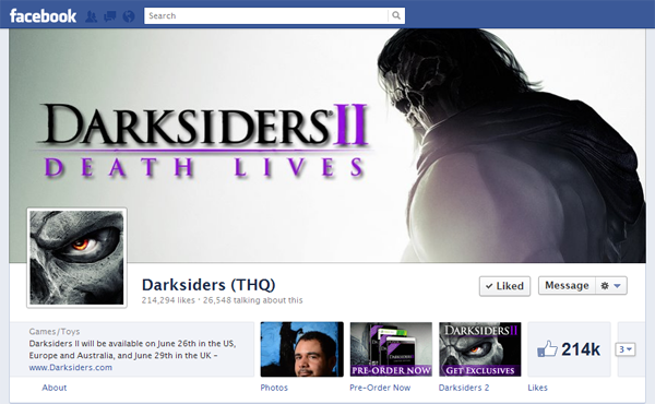
Darksiders (THQ):
Demonstrates simplicity and good tab icon/image design.
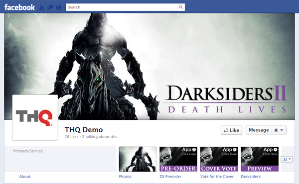
Demo Page:
Demonstrates “minimize-proof” cover design and “fool proof” tab images.
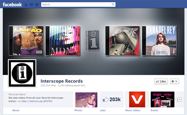
Interscope:
Demonstrates creative cover design.
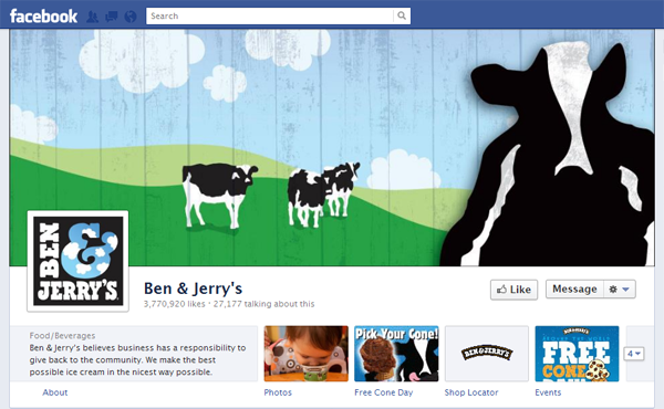
Ben & Jerry’s:
Demonstrates creative cover design, reinforcing use of profile photo (as logo), and good tab image design.
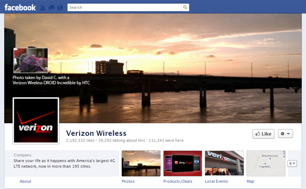
Verizon Wireless:
Demonstrates use of user generated content in cover design and use of photography in tab image design.
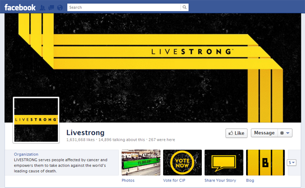
Livestrong:
Demonstrates good iconic tab image design.
Need Inspiration? Here are list of great cover examples for ideas and inspiration!

